Building a Sustainable Brand: The Ørsted Story
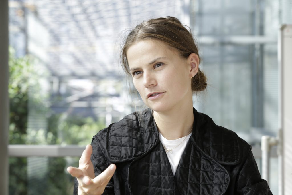
DONG Energy is the largest energy company in Denmark. It was founded in 1972 to manage gas and oil resources in the North Sea (DONG originally stood for “Danish Oil and Natural Gas”), but by the early 2000s it had begun to shift its focus from “dark energy.” Earlier this month, DONG announced that it will completely abandon coal by 2023, and become Ørsted. The new brand is a complete reflection of the company’s choice to move toward renewable, sustainable energy. The Works reached out to Louise Ryberg (the head of design on the rebranding project, and who works on the Corporate Branding team) to discuss her team’s process, and how they arrived at a brand that so accurately reflects the company’s commitments and sense of purpose.
The creation of the new brand was a three-way collaboration between Kontrapunkt (a leading Scandinavian design agency), Wieden and Kennedy (an international firm best known for its bold work with Nike), and an internal creative team at DONG that eventually grew to 20 people. As head of design, Ryberg could have been daunted by the complexity of the creative team and by having many perspectives to visually align. However, according to Ryberg, the opposite turned out to be true. “The complexity – the combination of two agencies – was actually the strength. For design we chose a Danish company that we could work really closely with – I actually sat at Kontrapunkt for 50% of my time for half a year. So from them, we had the Danish tradition and design heritage. But for brand strategy we had an international company, Wieden and Kennedy. That really helped us to look at ourselves from different eyes.”
One of the first steps for Wieden and Kennedy, Ryberg recalls, was to persuade DONG to abandon its characteristic Scandinavian reticence and humility, and bring some pride to the equation. “When we are talking about ourselves, we are humble. DONG has had the reputation [domestically] of being very corporate and out of touch, but we are quite small in a global context and extremely innovative compared to other companies. And we had Wieden and Kennedy say to us: ‘You’re a company we are glad exists.’ We are not used to hearing that.”
“I believe that everything we create to some extent changes the world we live in. Every chair, every website and every poster modifies our reality. Consequently, everything we do as designers has an impact on the world. In my designs I will strive to make my impact a sustainable one.”
As part of the new brand, DONG landed on two pieces of strategic messaging that reflect their sustainable purpose. They’re fantastic: “Love your home” is a tagline that works for employees and consumers, while “Let’s create a world that runs entirely on green energy” is a long-term mission that speaks to both consumers and investors. They are inclusive and altruistic. But when Wieden and Kennedy proposed “Love your home”, it was initially hard to accept as a tagline. “Because with Ørsted, we don’t have the word ‘energy’ in our name anymore. So should we not have it in our tagline? ‘Love your home’ could be anything; it could be IKEA. But I have never seen my colleague [in creative strategy] smile so much as when it was proposed. It was what we had been waiting for. We could see there was so much potential.”
On October 2, DONG called for an extraordinary general meeting to ask for approval to change its name. It’s a situation many branding agencies have been through: you’ve done the work, and the creative is there, but your fate is in the hands of a board who may or may not agree with your vision. “There have been a couple of those meetings,” Ryberg recalls. “The first was to find: could we change the name. And so we had to kind of visualize for them, how could this new brand be. We did mood boards and atmospheres. And it was ‘yes’; everyone was agreeing that Ørsted was the name – not that it was easy to find it.”
The name Ørsted is inspired by Danish scientist Hans Christian Ørsted. He was the physicist who noticed that wire carrying electrical current affected the compass sitting next to it. Electromagnetism was born. And if you want to name your eco-minded company after a scientist, Ørsted is a pretty good choice. He thought a lot about “unity and nature,” and was, in general, a highly observant guy who noticed that technology can have invisible impacts. And finally: if you open up a wind turbine, you’ll find a bunch of coiled wire and magnets. To us, as outsiders, it feels as if the company was meant to become Ørsted. And that’s where you want to be. Louise feels this too: “With the story and the legacy – there is such a valid history behind that name. It was one of the very first ones, rather than the only thing we could get. It was something really strong – we believed it. I have pictures of the earliest batches of names, and there it is: on one of the Post-it notes. It was created by our in-house Lead Creative Strategist, who is not only extremely creative but also understands the company.”
The name change was a necessity. DONG stands for commodities that the company is not associated with anymore. So changing the name was a given, but this rebrand is a total reimagining of how the company visually presents itself. And that was a very conscious choice. The DONG brand is technical and detached at times; Ørsted is entirely human-centred. The brand launch video is anchored by the invitation to “Love your home,” but really, it asks us all to love the home we share – our Earth. Ryberg explains: “The brand is not only about energy. It is about life and it’s about opportunities. The biggest leap of optimism was, if we can create a greener world, we have created a greater life for human beings.”
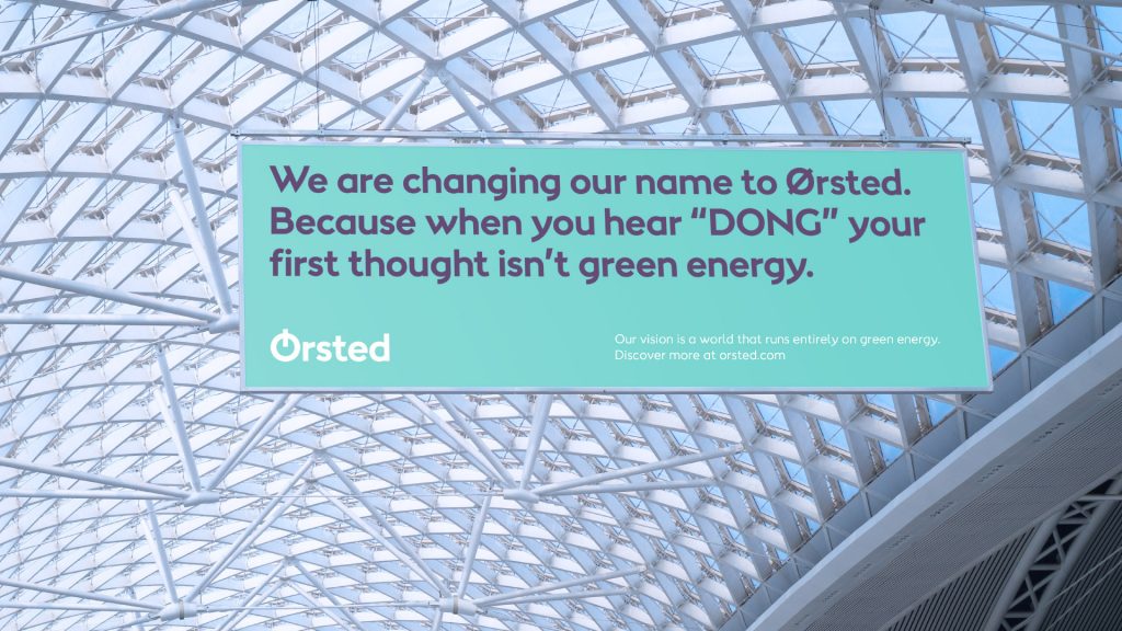
DONG stood for “Danish Oil and Natural Gas” – it became a problematic acronym as the company’s visibility grew internationally.
When asked whether they ever considered maintaining the existing look and feel, Ryberg explains that, instead, they considered it the other way around. “We talked about if we could change the identity but not the name, but it wasn’t right. It’s because our company has changed and we need to reflect in our brand what our company does; therefore, we have to change everything.”
The attention to that “everything” is almost touching, in a way. Even a marketing skeptic would have to appreciate the nuance. Kontrapunkt, which has a specific legacy in typefaces, advocated for a custom font. “It was really early on in the process that we realized we needed to look at the typography,” Ryberg recalls. “We report on sustainability and other things that are really fact-based – there are a lot of written words. So we thought a lot about how people actually see those words. How do you want people to see the words ‘wind power’? Are those mechanical words? Optimistic words? So, particularly with our W, you see it sort of flying away.”
And she’s right. The font has all sorts of upward curves, and naturally tilts up and to the right. It’s lively – and optimistic. Optimistic Ws.
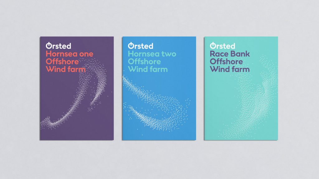
The custom typeface (created by Kontrapunkt) is inspired by classic Danish functionalism and designed to feel lighthearted and optimistic. Consideration was given to how stakeholders might feel when they read certain words. What sort of a word is wind? How should it feel to read it?
The colour choices are equally thoughtful and, like much of the brand, are rooted in Danish heritage and identity. The primary colour, blue, is a nod to Ørsted’s main business – a windmill standing in the sea and the sky – but is also informed by Danish modernist painter Vilhelm Lundstrøm. He went on a hunt for an “eternal blue.” The whole palette was considered with equal care. “When we did an analysis on our existing colours, even the yellow had black in it.” Louise laughs. They couldn’t tell the visual story of DONG without using black ink. “It was too funny, this oil and gas company, and every colour has black in it. Even the yellow. So the first thing we decided was we’ll have bright colours. Without any black. And because our brand is inspired by Danish functionalism, we looked at other colours used in that period.” She explains that though the broad perception is that architecture of that time was very white, “when you go inside where the people are, there are all these optimistic colours.”
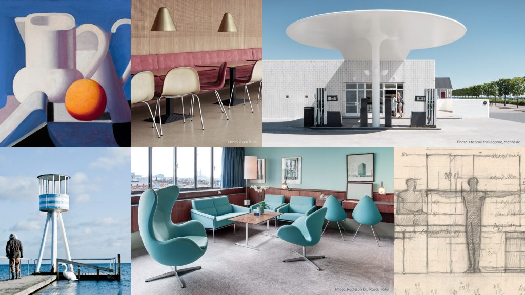
Moodboards and Atmospheres that inform the colour palette and wider brand personality include photos of Nordic design and everyday life.
We finish by discussing what, if anything, Ryberg can point to that set the team up to really “find themselves.” What was the trick? What workshop technique brought out the truth, their purpose, that perfect tagline? Where was the a-ha moment? Because it’s clear: landing on a strong sense of purpose, and being a purpose-driven organization, resulted in a brand that truly reflects the Ørsted identity. Who they are, where they are going and all they are going to become. And as a creative bunch, we truly love her answer: “We had the time. There was always something – an IPO, our oil and gas business getting sold. So we were always ready to launch tomorrow. We never knew we were going to have two years [to develop the brand]. But that’s what worked. When we first started, we were really careful: what can we do? What can we say? But eventually, we started to speak more boldly. It was time that worked for us. And maybe that’s boring. It’s not any one workshop. It’s all of them, because it all starts to become clear very gradually. That is the key.”
Learn more about the Ørsted rebrand at www.orsted.com.
Louise Ryberg is extremely clever, and has a personal design website at http://louiseryberg.com.